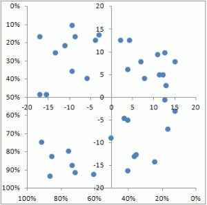
The goal: create a chart in Excel that plots data points on a percentage scale for X and Y, and also shows quadrants with a different scale. Extra challenge: The X and Y axis run from 100% to 0% instead of the normal 0 to 100.
Here is a picture of the goal:
Following is a step-by step for creating such a chart.
Chart data
The plotted data points are sourced from these two columns of values. For this example, RANDBETWEEN was used to create a data sample with values ranging from 0 to 1.
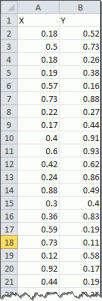
This data will ultimately be plotted on the outer X and Y axes of the chart, which will be formatted to show percentages from 100% down to 0%.
First, though, we need to take care of the lines that demarcate the quadrants.
Quadrant data
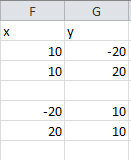 The quadrant data series are two dummy series that will be used only to set the X and Y axis for the quadrant dividers. The data series will ultimately be formatted to be hidden, but to start the chart off, they will be visible.
Step 1 – Chart the dummy series
The first step is to create an XY chart from the data in F2:G3. Then, a second series is added with the data in F5:G6.
Select F2:G3, insert an XY chart and hit OK. Next, go to edit the data series set:
Series X values =Sheet1!$F$2:$F$3
Series Y values =Sheet1!$G$2:$G$3
Add a second data series with the settings:
Series X values =Sheet1!$F$5:$F$6
Series Y values =Sheet1!$G$5:$G$6
The result should look something like this:

Step 2 – some basic formatting
Format each data series to show no markers, but set a visible line. Delete the grid lines and the legend. Select each axis and set the minimum value to -20, maximum value to 20 and major unit to 5. After that, the chart looks something like this:

Step 3 – add the main data
The helper series are now no longer required, but we will just hide them instead of deleting them, so that their values still have an effect on the axes we see. Click each data series and set the line to none.
Next, select the data in columns A and B, starting in A2 (i.e. not selecting the header). Copy the selection. Now click the chart and use Paste Special. Set the option to add the pasted values as a new series, with Values (Y) in Columns, and tick the Categories (X Labels) in First Column tick box. The result should look like this:
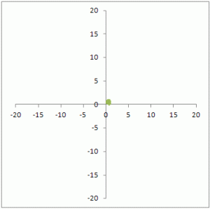
You’ll see a scramble of overlapping data points near the 0 cross-point of the two axes. Since the scale of the existing axes ranges from-20 to 20 and the newly added data series is between 0 and 1, it all bunches up in one place. We’ll change that now.
Step 4 – send the main data to the secondary axis
Right-click the bundle of data markers that represents the newly added series and open the Format Series dialog (my preferred keyboard shortcut for that is Ctrl-1). In the Series Options area, select Secondary Axis and close the dialog box. Next, activate the secondary X axis. In Excel 2007 and later, click the Layout tab in the Chart Tools and select Axes – Secondary horizontal axis – Show default axis. Now your chart will look something like this:

Step 5 – Format the main data series
The remaing steps are really all about formatting. Select the visible data series, and open the Format Series dialog. Set Line Color to No line. If you want, choose a different marker symbol and different marker color. In the attached example, the marker is a circle with a blue fill, no borders and a size 7.
The chart will now look something like this:
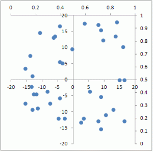
Step 6 – format the outer axes
The secondary axes are showing at the top and on the right of the chart. Open the format dialog for each axis and select the Values in revers order tick box.
Now the secondary X and Y axes appear in the place where you’d normally expect the primary axes, but they start at 100% at the crossing point and go to 0% at the end.
Here is an image of the finished chart again:

Download the attached sample file to study each of the steps above. The attached file was created with Excel 2010 and saved in Excel 2003 compatible format.
[…] Since I am no expert in excel, I looked up how to create the 4 quadrant graph and the link below was extremely helpful and detailed – http://www.teylyn.com/articles/excel-articles/xy-scatter-chart-with-quadrants/ […]
LikeLiked by 1 person
[…] Quadrant data. The quadrant data series are two dummy series that will be used only to set the X and Y axis for the quadrant dividers. The data series will ultimately be formatted to be hidden, but to start the chart off, they will be visible. Step 1 – Chart the dummy series. The first step is to create an XY chart from the data in F2:G3 … https://teylyn.com/articles/xy-scatter-chart-with-quadrants/ […]
LikeLike