Sparklines have been introduced with Excel 2010 and are a useful tool for creating small in-cell charts, used for example in dashboards.
Excel 2010 offers three different types of Sparklines: Line, Column and Win/Loss. What it does not offer is a way to create stacked column charts or combination charts with columns overlaid by a line.
But with a bit of preparation and few tools from the trick box, it can be done.
Stacked Column Sparkline
1. Create Sparklines
Start out with two Sparklines, Blue data and Red data. The source data in this example is arranged in a table with two columns, Blue and Red. The goal is to create a Sparkline that stacks the blue columns onto the red ones.

2. Create a Helper Sparkline
To achieve that, first go to the data table and add a helper column that sums the values of Blue and Red. Then create a Helper Sparkline which shows the newly summed data. It looks like this:

3. Align Y Axes
We need to ensure that all three Sparklines have the same Y axis settings. Select all three Sparklines, click the Design tab of the Sparkline Tools and select the Axis drop-down.

Set the Vertical Axis Minimum Value to a Custom Value (in the example it is 0 ) and the Vertical Axis Maximum to a Custom Value (in the example it is 10).
4. Create a dynamic image of the Sparkline
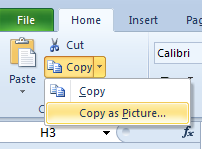
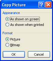
Next, select the cell with the Helper Sparkline and use the Copy drop-down on the Home tab and copy the cell as a picture, accepting the default in the Copy Picture dialog.
5. Paste and link
Paste the picture into a cell. This is a static picture and will not update when the Sparkline changes. To make it dynamic, select the picture, then click into the Formula bar, enter a = sign and click on the cell that has the Helper Sparkline.
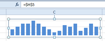
Now the picture is dynamic and will show whatever content is in that cell. Note that the picture has a transparent background (you can see the Excel grid in the background). This is because the source cell has no color fill.
6. Copy second Sparkline
Repeat the Copy Picture process for the Red Sparkline, paste it and link it to the Red Sparkline cell. The transparent picture background is essential for the next step to work, so make sure not to use fill colors in the Red Sparkline cell.
7. Drag to overlay
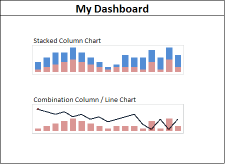
Now drag the two pictures on top of each other. The Blue one is in the background and the Red one is in front. Since the background of the Red picture is also transparent, the taller blue columns will peek out above the red columns, thus effectively creating a Stacked Column Sparkline.

Combination Column / Line Chart
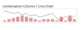
The steps are the same as above, but this time the front picture has been taken from a Line Sparkline.

Tip
If the line in the image looks a bit ragged, open the Format Picture dialog and on the Size tab adjust the Height and/or Width by a percentage point. In the example, I changed the Height from 104% to 105% and the ragged line in this screenshot was restored.
Here’s the Combination Column / Line Chart:
Some hints and tips
The biggest challenge is probably to align the two images perfectly. If you hold the Alt key while dragging a picture, it will snap to the nearest cell border. First drag and snap the background picture to the upper left corner of a cell, then drag and snap the foreground picture to the same position and they should be perfectly aligned.
Why not simply overlay the Helper data Sparkline with the picture of the foreground Sparkline?
Well, the picture of the Sparkline is not exactly the same size as the cell. It is a few pixels off, enough to be irritating and a pain to resize manually. It’s easier and faster to create two pictures, since they will have exactly the same size, and will align perfectly when placed on top of one another.
Here is the finished Mini-Dashboard. The attached file was created using the steps outlined above. Some of the source data is generated with Randbetween(). Open the file and hit the F9 key to see the Sparkline images update instantly. Enjoy.
Download the file
This article was first published in February 2011 on Experts Exchange.